Tiempo
Reshaping how you interact with your fitness app.
" height="359.81217777777783px" id="SkAEDF3i6" transform="translate(63.107 0)" width="157.61763920274632px"/><path d="M 4.558 132.89 C 14.632 122.017 24.467 110.823 34.062 99.308 C 43.657 87.635 52.613 75.96 60.928 64.287 C 64.127 63.967 67.645 64.047 71.483 64.526 C 75.481 65.006 78.759 65.886 81.318 67.165 L 81.318 247.55 C 81.318 284.971 67.645 303.681 40.299 303.681 C 27.666 303.681 17.751 299.924 10.554 292.408 C 3.518 284.891 0 274.577 0 261.463 C 0 232.359 19.83 205.093 59.489 179.666 L 59.489 104.346 C 54.691 110.102 49.814 115.86 44.857 121.616 C 39.899 127.214 35.182 132.411 30.704 137.208 C 26.386 141.846 22.628 145.605 19.43 148.483 C 15.752 146.883 12.553 144.884 9.835 142.485 C 7.276 139.927 5.517 136.729 4.558 132.89 Z M 21.589 260.984 C 21.589 267.86 23.188 273.217 26.386 277.056 C 29.585 281.054 33.982 283.053 39.579 283.053 C 53.172 283.053 59.969 271.219 59.969 247.55 L 59.969 204.613 C 34.382 222.684 21.589 241.474 21.589 260.984 Z M 71.962 32.623 C 67.485 32.623 63.647 31.024 60.448 27.825 C 57.25 24.627 55.651 20.789 55.651 16.312 C 55.651 11.514 57.17 7.596 60.209 4.558 C 63.407 1.519 67.325 0 71.962 0 C 76.76 0 80.678 1.519 83.716 4.558 C 86.755 7.596 88.274 11.514 88.274 16.312 C 88.274 20.949 86.675 24.867 83.477 28.065 C 80.438 31.104 76.6 32.623 71.962 32.623 Z" fill="rgb(255, 255, 255)" height="303.6810940978712px" id="sDF83yTBA" transform="translate(0.28 56.127)" width="88.27394645616337px"/></svg>)

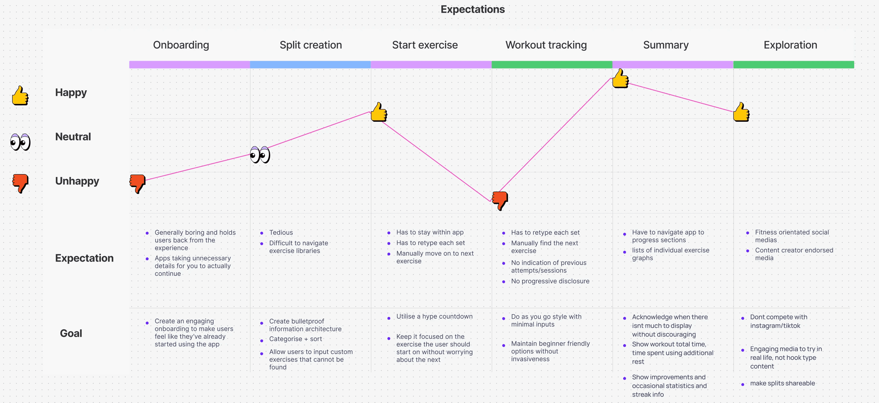
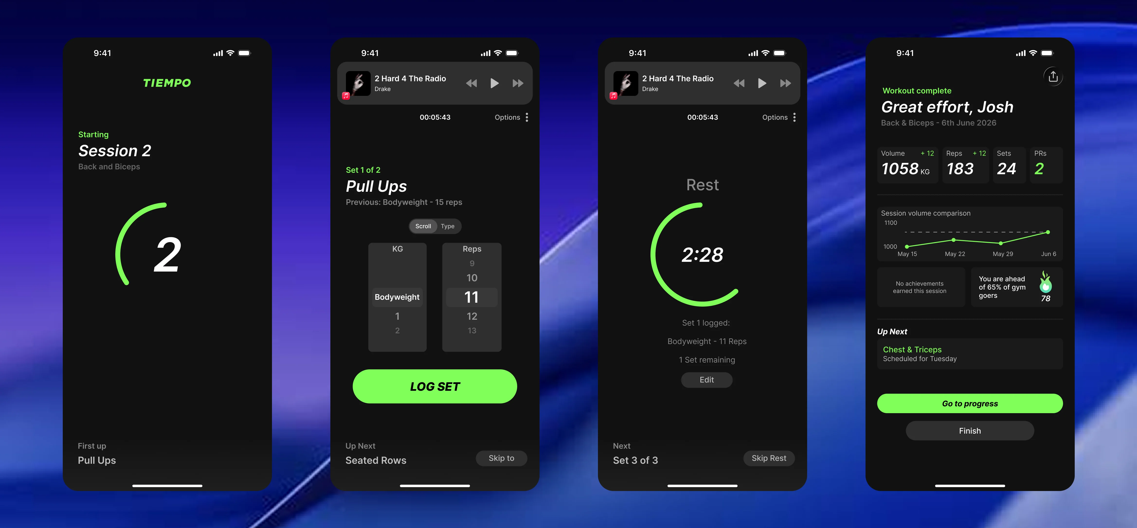
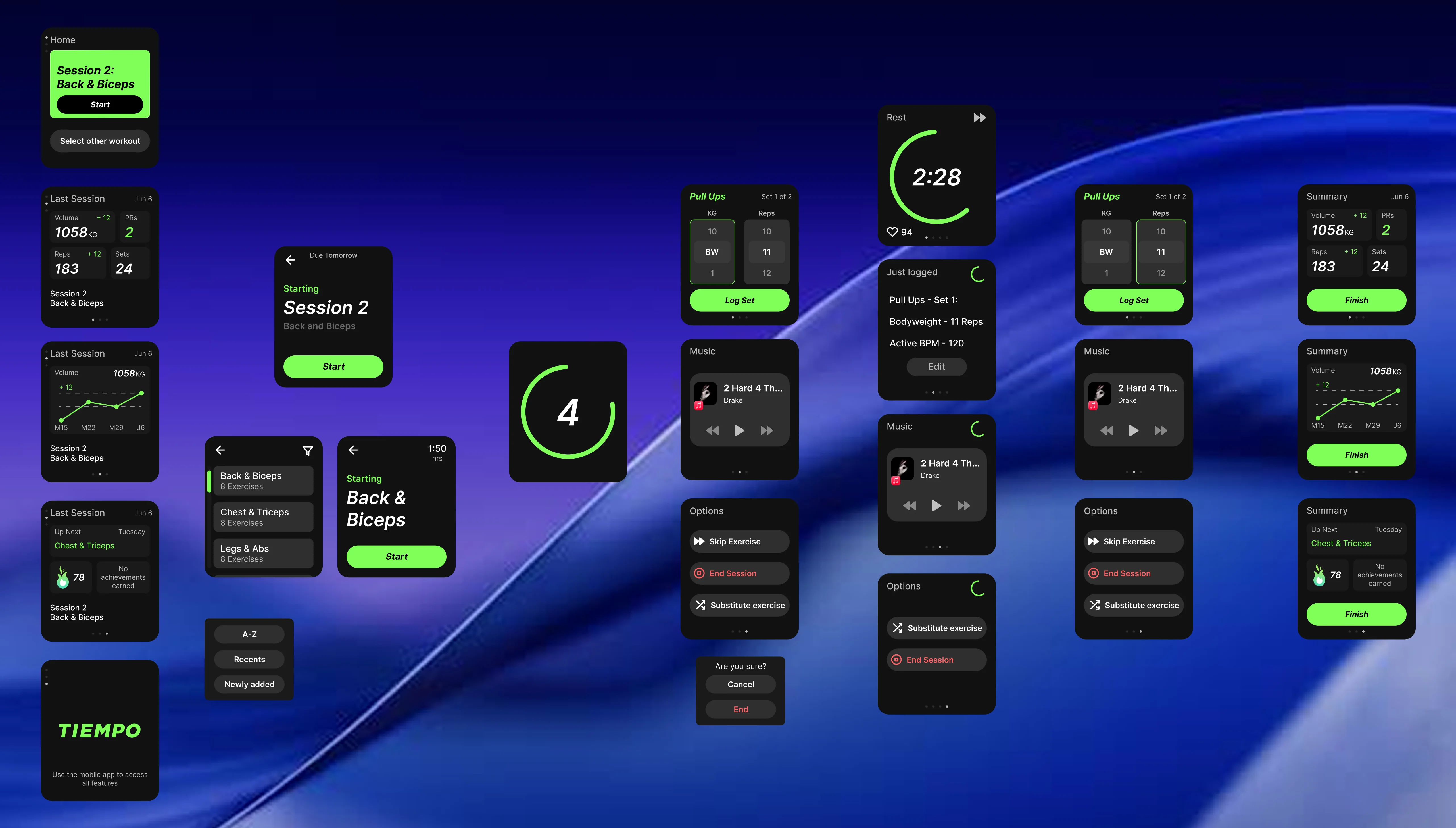
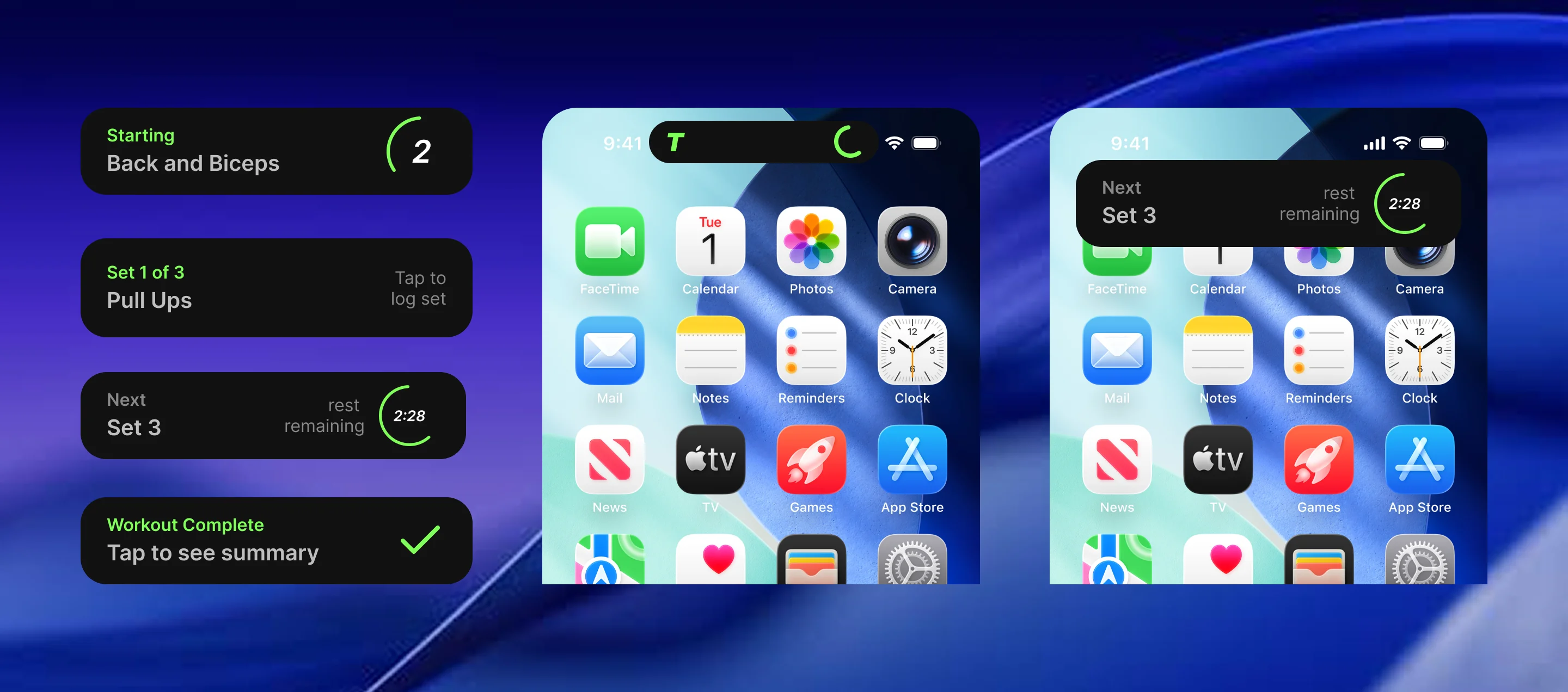
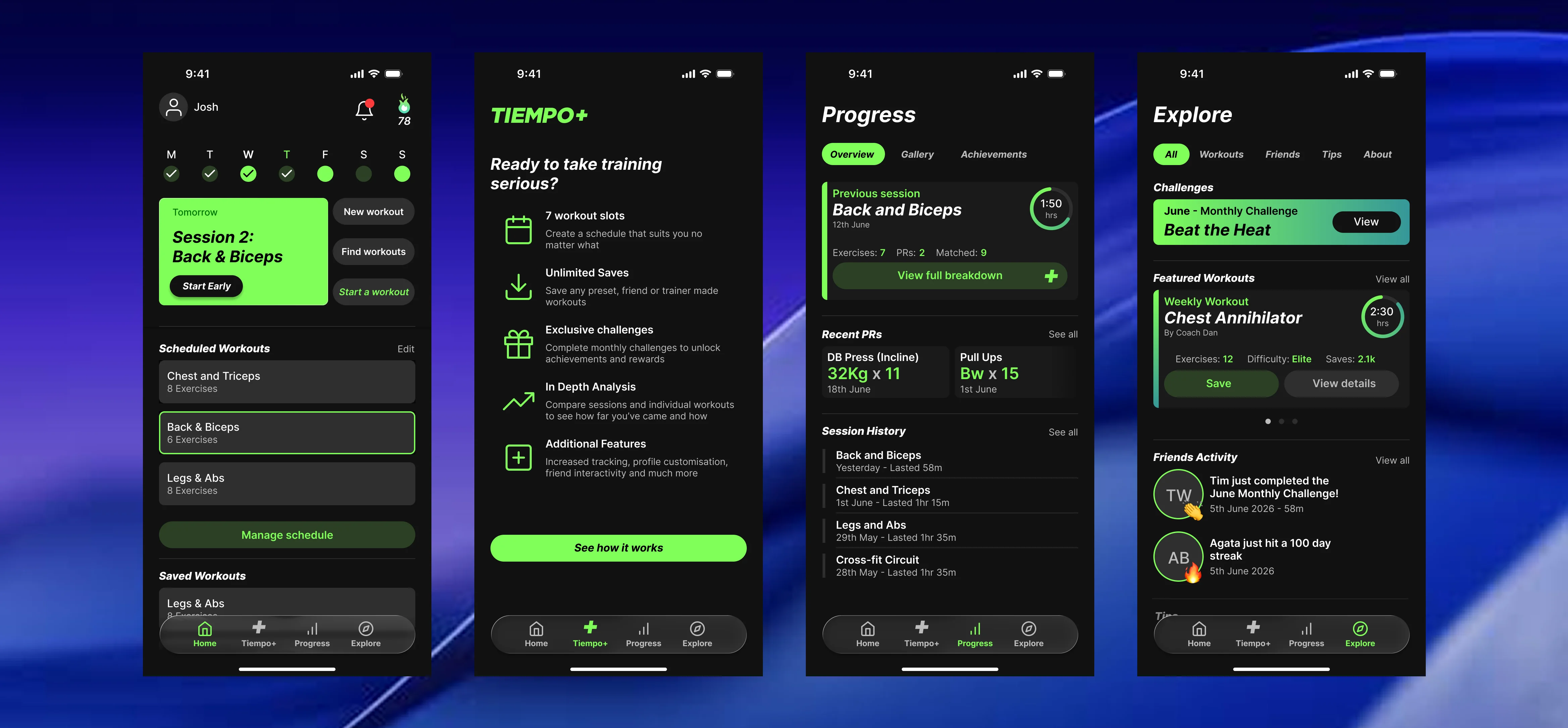
Streamlined doesn't mean stripped. The home screen covers everything needed for a workout, while three additional tabs sit within the main navigation for anyone who wants more.
Tiempo+ is the subscription layer which transforms to rewards once enrolled. Progress holds session history, PRs, a photo gallery, and achievements. Explore rounds it out with challenges, difficulty-graded workouts from in-app coaches, friend activity, and articles for building fitness knowledge.
This strengthens the concept of not trying to compete with a dedicated content or social app. If someone wants to browse fitness content to pass time, they'll choose a media app over a workout tracker almost every time. These features exist for people already using Tiempo, not as a reason to open it.
Small test, clear signal
Five users completed two short workouts each, once on Tiempo's prototype and once on an established competitor app. It's a small sample, and testing your own product carries an obvious bias worth naming outright rather than glossing over.
Even accounting for that, the results were consistent. Logging a set took 3 to 4 seconds in Tiempo versus 9 to 11 seconds in the competitor, roughly three times faster, with occasional input errors pushing the competitor's time past 15 seconds. All five users said they preferred Tiempo's input style. One user couldn't figure out how to log a set or start a workout in the competitor app at all, a result kept out of the speed comparison but worth noting on its own.
3X~ Faster
Tracking
5/5 Preferred
versus competitor
NEXT STEPS
User testing + optimising inputs
Refined micro interactions